My wife and I went to see “Up” this afternoon, and walked out of the theater with smiles on our faces. The Pixar team has done it again, for a remarkable tenth time.
Ironically, before “Up” began, we had to sit through previews for other upcoming animated movies, including “Ice Age 3,” “The Princess and the Frog,” and “Planet 51.” It didn’t take long to see, via their trailers, the huge creative chasm that exists between those efforts and the work by the geniuses at Pixar. If I’d produced one of those other animated movies, the last thing I’d want is pit my work against the best in the business and give people an opportunity to see how it pales in comparison.
Pete Docter’s crew consistently melds wonderful storytelling and character development with amazing computer animation and lifelike scenery — but they never neglect the little details, those extra moments that make you say, “wow!”
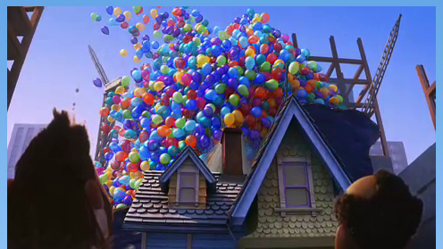
For example, in “Up,” shortly after Carl’s house lifts off its foundation and begins its airborne adventure, we see reaction shots of various people shocked by the sight of a house suspended below thousands of balloons. At one point, the point of view is from inside a little girl’s apartment bedroom and, as the balloons pass by her window, the sun shining through them causes a kaleidoscope of colors to dance on her floor. The girl is delighted at the sight before turning around to see the source of the refracted beauty, and then smiles even wider. It’s a scene fragment that only lasts a couple of seconds, but it was the first thing my wife and I mentioned to each other after the credits rolled.
The filmmakers didn’t have to include that scene — no one would have missed it if they’d left it out — but once they thought of it, I bet they worked their butts off to make it perfect. That’s the kind of bonus creativity I look for in a movie.
