“What happens in Vegas, stays in Vegas.”
“Virginia is for lovers.”
“I love New York.”
“St. Louis all within reach.”
Which of these slogans is not like the others?
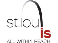
The last one is the newest slogan for our town, unveiled with a new logo yesterday by the Convention and Visitors Commission. As soon as I saw it, I didn’t like it, and neither did most of my listeners.

I have no problem with promoting our city to the rest of the country as a place to visit and bring your business. It’s the graphic that bugs me. What’s the “is” doing offset like that? It changes the name of our town to “St. Lou.”
No one here calls it that. No one anywhere calls it that. It’s like when there’s a concert and the lead singer stands on stage and greets the crowd with, “How ya doin’, St. Louie??” Well, we’re doing fine, except that we don’t call our town St. Louie. It’s St. Louis. You pronounce all the letters and all three syllables, if you don’t mind.
Maybe I’m sensitive to this because my name, like our town’s name, ends with the -is suffix, and I don’t like seeing it dropped. My nickname is not Paul Harr. This website is not called Paul Harr Is Online.
Can you imagine trying this elsewhere? “parIS the capital of france.” “memphIS the home of elvIS.” Now we’re really debating what the definition of “is” is. Or capitalize the last two letters of Chicago and turn it into “chicaGO.” Actually, that looks like you’re telling a young hispanic woman to leave — Chica, Go! — in some sort of immigration argument.
I know what the CVC is trying to say with “St. LouIS All Within Reach” — that St. Louis is a town you can get to from anywhere easily, that we have whatever you need, that there’s lots of stuff here for you. But if that’s true, why did the CVC hire a company from Kansas City to come up with the new slogan and logo? Apparently, “all within reach” doesn’t include any design firms on our side of the state.
Of course, if they’d asked anyone here, they would have been told, “St. Lou IS Not What We Call Our Town.”
